This visual identity guide has been developed to support the Hanko tourism brand and ensure consistency across all channels. The aim is to provide clear and practical guidelines for the use of the logo, colours, typography, illustrations, photographs and other visual elements. These will help to create a consistent and recognisable image that will strengthen Hanko’s attractiveness as a tourist destination and distinguish it from its competitors.
A strong image is based first and foremost on a consistent visual and communicative presence. The visual identity is the foundation of image building and influences how the public perceives and sees Hanko as a tourist destination.
Following the guidelines will ensure that Visit Hanko’s communications are consistent, of high quality and reflect the spirit of Hanko in all materials used by the various tourism stakeholders – whether event publications, digital campaigns or print advertising. A coherent visual identity not only fulfils practical communication needs, but is also an important strategic tool for the long-term development and maintenance of the image of Hanko.
Logotype and usage of the logo
The Visit Hanko logo consists of the name and a graphic element representing the sun that often shines in Hanko.
PRIMARY: Mainly the bilingual logo in the colours Water Tower and Sea are used.
NEGATIVE: The negative is used over a dark coloured surface.
The logo should be clearly distinguishable from its background and the background should be calm, not too restless.
Always use the logos in the colours Water Tower or Sea in the first place. Choose the colour that best suits the material.
The logo may only be used from the given materials – proportions and colours may not be edited.
Enough space should also be left around the logo.
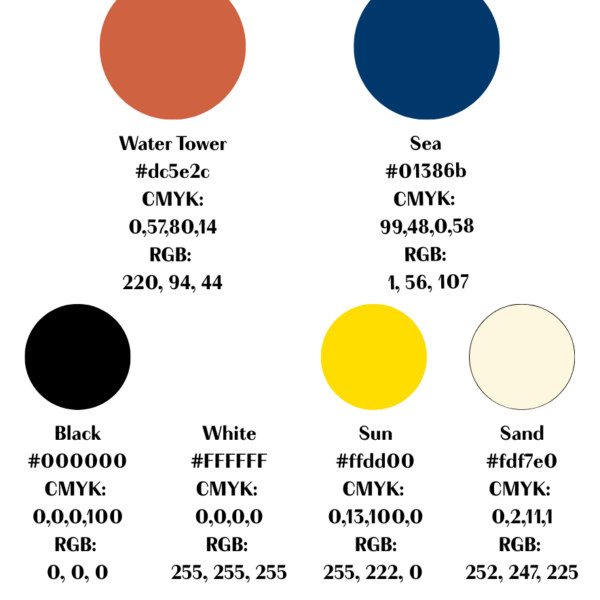
Värit
The main colours are Water Tower and Sea. The orange colour is named after the recognisable colour of the Hanko Water Tower, and the blue, Sea, after the sea that surrounds Hanko from three directions.
Sand beige, inspired by Hanko’s 30 kilometres of sandy beaches, is used as a complementary colour. Black and white are used as complementary colours mainly in the text.
The yellow colour Sun acts as the colour of attention.
Pay attention to contrast, clarity and readability when using colours.

Typography
Visit Hanko uses two official fonts.
In the marketing materials the paid font Boutique is used.
Alternatively, the Arial font, which is available free of charge in Office programmes, can be used in bold.
Other fonts or handwritten text illustrations are not allowed.
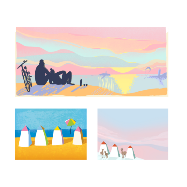
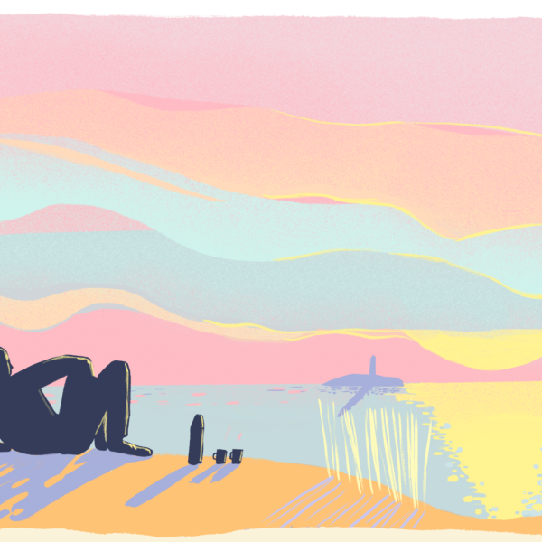
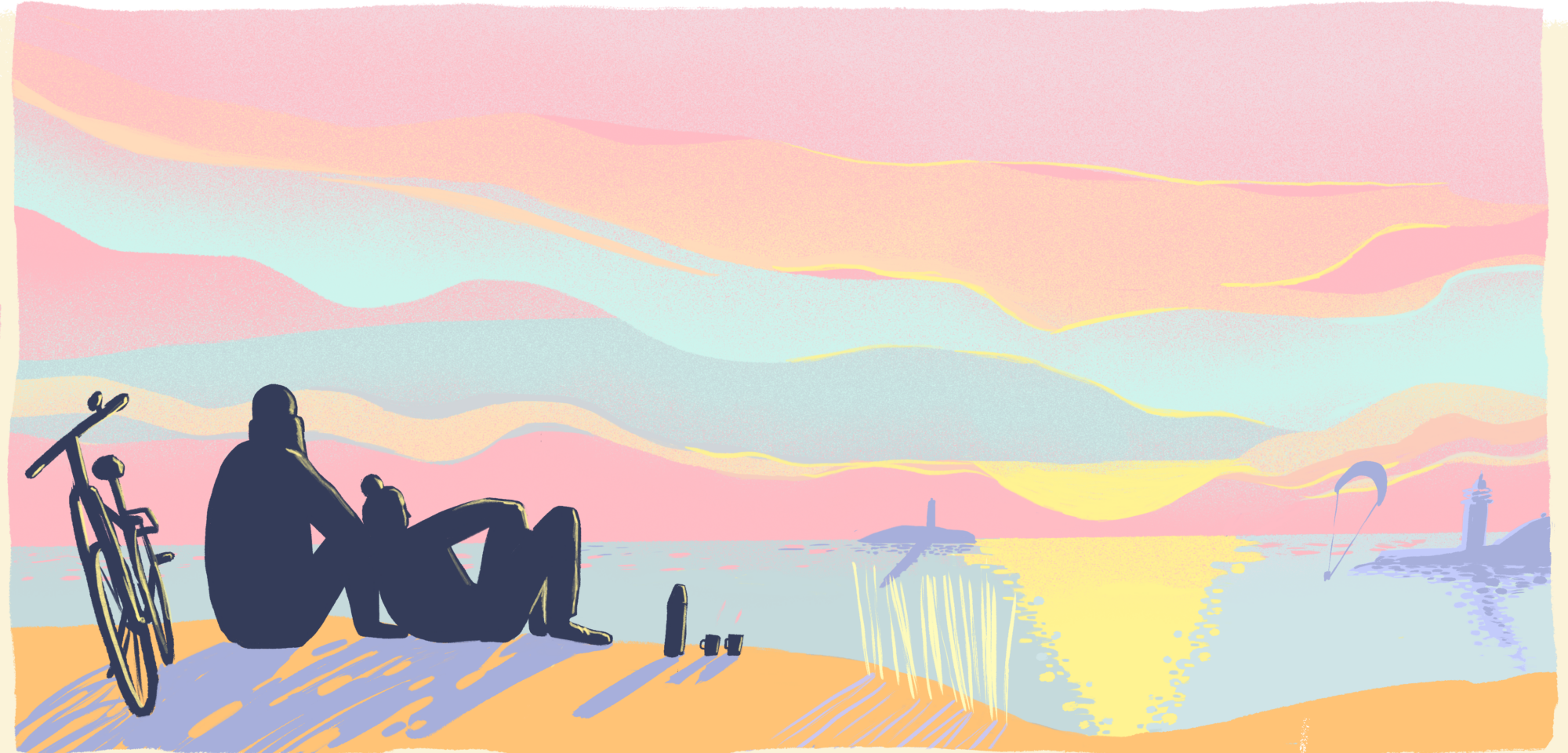
Illustrations
The illustrations are strongly inspired by the nature of Hanko. Pastel-coloured sunrises and sunsets, foaming or reflecting seas, enchanting snow cover, endless sand dunes, sloping pine trees and diverse nature are strongly reflected in the illustrations.
The illustrations also convey the Hanko lifestyle and invite you to fall in love with Hanko.
Visit Hanko’s illustration style is:
- Cheerful and playful, conveying Hanko’s experientuality
- Somewhat abstract and simplified, with reality reduced to recognisable elements
- Colourful, with Hanko’s colour palette
- A bright and inviting visual language inspired by the experiences and landscapes of the coastal town
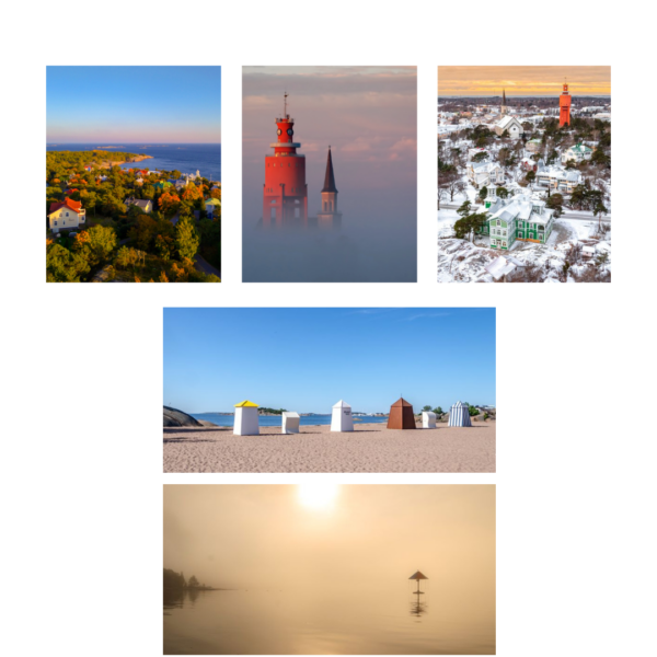
Photographies
The photos show the main landscapes, landmarks and activities in Hanko during different seasons.
Photos of people show real moments and experiences, not poses or professional models. Diversity is also reflected in the images.
The photos focus on Hanko’s strengths: its beaches, historic architecture, nature and maritime activities.
The atmosphere of the photos should be genuine, not too staged or commercial.
The quality of the photos:
- Natural light is preferred in the photos
- Photos should be of high technical quality, accurate and suitable for different uses (print and digital)
- Photos can be cropped to different formats, so the composition should leave room for margins
- Always ensure that you have the right to use the photos and mention the names of the photographers in accordance with the guidelines
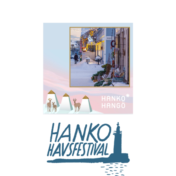
Application and visuals for events
The guidelines provide guidance on the consistent use of Visit Hanko’s visual identity across materials and channels. Minor adjustments are possible, as long as the core image of the brand is maintained.
The visual expression of events is based on and follows Visit Hanko’s visual guidelines. A coherent visual identity strengthens the visibility of tourism in Hanko.
On the right you can find examples of different implementations.